
The festive season is just around the corner, and shoppers are gearing up to find that perfect gift. Your seasonal emails can be the spark that ignites their interest!
With 20% of holiday online sales driven by email marketing, savvy entrepreneurs like you can’t afford to miss out on this opportunity to boost engagement and conversions through seasonal campaigns.
As you craft your messages—whether promotional emails, loyalty program updates, or cart abandonment reminders—remember that mobile responsiveness is key. With 71.5% of consumers checking emails on their mobile devices, optimizing for mobile isn’t just smart; it’s essential.
During peak shopping times, such as limited-time sales and holiday promotions, your audience must act quickly, no matter where they are. If your emails aren’t mobile-friendly, you risk losing potential customers who are on the go.
In this blog, we’ll explore why mobile-responsive email templates are vital for seasonal campaigns and share expert tips to help you create them like a pro. Get ready to elevate your holiday email marketing game!
What Are Mobile-Responsive Email Templates?
Mobile-responsive email templates are built to adapt automatically to any device—whether it’s a smartphone, tablet, or desktop. As more consumers check their emails on the go, having emails that look great on every screen size is a must. Instead of creating different versions of your email for each device, responsive design allows your content to adjust seamlessly, ensuring the layout, images, and text always look sharp.
The best part? Mobile-responsive emails don’t just improve the visual experience—they boost engagement and drive better results. When subscribers know your emails will load quickly and look clean on their phones, they’re more likely to open, read, and act on them. This leads to higher conversions and a healthier ROI for your campaigns.
Take a look at the example below:
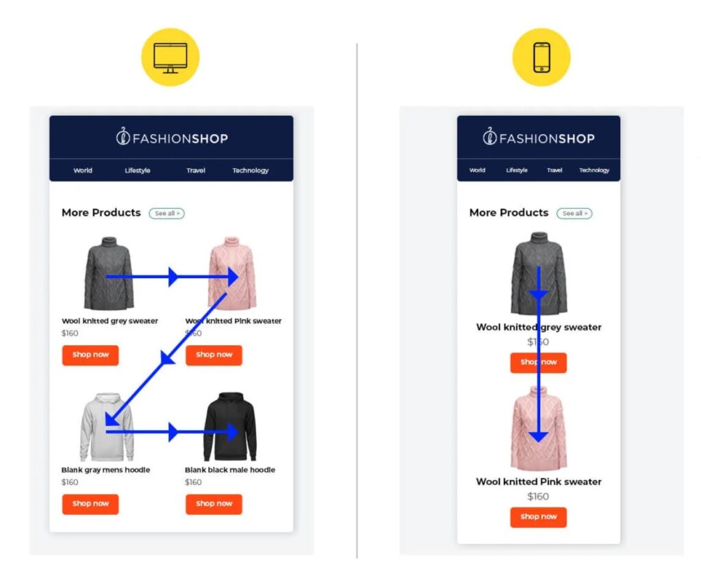
Image Source: Email Uplers
In the desktop version (left), the products are displayed in a horizontal grid, allowing users to view more items at once. However, when viewed on a mobile device (right), the layout shifts to a vertical format, making it easier for users to scroll through the products.
This automatic adjustment enhances readability and ensures that images, buttons, and text remain perfectly aligned for easy interaction.
This dynamic rearrangement helps users navigate your emails without frustration, regardless of their device. It’s a vital feature, especially during high-traffic seasonal campaigns when customers are constantly on the move.
By ensuring your emails are optimized for mobile, you cater to most consumers who rely on their phones for quick browsing and shopping, preventing potential loss in engagement and sales due to poor email formatting.
Why Mobile Responsiveness Matters For Seasonal Email Campaigns
The holiday season is the final sprint for many businesses, where email marketing becomes a crucial sales driver. As email volumes surge and inboxes become flooded with promotions, your seasonal email campaigns must cut through the noise.
But there’s a challenge—more than ever, consumers are turning to their mobile devices to shop on the go.
During high-traffic periods like Black Friday, Christmas, and Cyber Week, mobile usage reaches new heights. In fact, 44.2% of people opened their emails on a mobile device during the holiday season.
But it’s not just about opening emails. Shoppers are also converting, with mobile driving nearly half of all online sales during key sales periods—51% during Cyber Week alone in 2022.
This data shows a massive shift in consumer behavior, underscoring the importance of mobile-friendly email design. If your email isn’t optimized for mobile, you could miss out on a huge chunk of traffic and revenue.
Mobile-responsive email templates ensure that whether your subscriber is casually scrolling at home or quickly checking their inbox in line at a store, your content looks sharp, loads fast, and is easy to navigate.
By ensuring your seasonal campaigns are mobile-optimized, you’re meeting your audience where they are: on their smartphones. It’s no longer just a nice-to-have; it’s essential for maximizing your holiday conversions.
Responsive Email Design Best Practices
An interesting rule of thumb for mobile-responsive email templates comes from Mailchimp: “One eyeball, one thumb, arm’s length.” Your emails should be readable with one eye, tappable with one thumb, and easy to interact with at arm’s length. This reflects how people typically check emails on the go—often multitasking and using one hand.
To achieve this:
1. Start with a Mobile-First Framework
To make your emails responsive, start with a mobile-first approach. This means designing your email primarily for small screens and then scaling it up for desktops.
There are responsive email frameworks, like MJML, that make this easier by providing pre-built components designed to adapt to different screen sizes. With such frameworks:
- You don’t need to code for different devices manually. They handle the heavy lifting, allowing you to focus on optimizing your content and visuals.
- They ensure that your emails resize appropriately across mobile, tablet, and desktop, handling complex coding issues for you.
2. Use Fluid Layouts
A fluid layout is essential for ensuring that your emails adapt seamlessly to various screen sizes. By using percentage-based widths rather than fixed sizes, your content can scale without breaking or looking awkward on different devices.
Key principles of fluid layouts:
- Single-Column Design: A single-column layout is the easiest to manage in responsive email design. Emails with multiple columns are more likely to break on mobile clients and require additional testing.
- Avoid Fixed Widths: Using fixed pixel sizes can cause images or text to overflow on small screens. Instead, use percentages to let the content adjust dynamically.
- Center Your Content: This keeps things visually balanced across all devices, ensuring your email doesn’t look off-kilter on smaller displays.
3. Use Media Queries for Adaptation
Media queries are essential in responsive email template design. They allow you to adjust your email’s width and other styling aspects based on the device’s screen size.
For example, you can specify that certain elements should stack vertically on mobile while remaining horizontal on desktop.
4. Prioritize Font Size and Readability
Nothing frustrates a mobile reader more than having to zoom in to read an email. Keep your text sizes large enough to be readable on small screens.
Font size recommendations:
- The minimum font size is 16px. It ensures the body text is legible without requiring zooming or squinting.
- Apple recommends a font size between 17–22px, while Google recommends 18–22px for mobile devices.
- Stick to clean, easy-to-read fonts like Georgia or Arial, as these render well across different email clients and devices.
5. Optimize Call-to-Action (CTA) Buttons
Calls-to-action (CTAs) are crucial for email performance, and making them accessible on mobile is a must.
According to Apple’s guidelines, the target area for a tappable button should be at least 44×44 pixels to ensure users can click without frustration. Additionally, spacing buttons and links adequately help avoid the risk of mis-clicking.
CTA Best practices for Mobile-responsive Email Templates:
- On mobile, CTA buttons that span the full width of the screen are easier to tap, especially for users who may be using only one hand.
- Avoid clustering too many links or buttons in a small area. This makes individual elements hard to access, particularly for mobile users.
6. Size Images Properly
Improper sizing can cause emails to load slowly or appear distorted. To avoid this, always optimize images for fast load times while maintaining visual quality.
Don’t go too big or too small. Oversized images slow load times, while overly small images might look pixelated or lose their impact.
Always include alt text for images. If an email client blocks your images from loading or a user has disabled images, the alt text will give context to what’s missing. This also enhances email deliverability, as spammers typically neglect this detail.
7. Hide Non-Essential Content on Mobile
One major advantage of responsive email design is the ability to hide less relevant content on mobile devices. Not all information from your desktop email is crucial for mobile users. By hiding certain elements, you can prioritize what matters most for small screens, ensuring an optimized user experience.
Here’s how:
- Identify which parts of your email should be highlighted on mobile. This might include special offers, key CTAs, or important announcements.
- Use media queries to hide less critical content or reduce the size of non-essential images and text.
8. Avoid Image-Only Emails
Avoid relying solely on images for your emails. Not only does this increase the likelihood that your email will be marked as spam, but your entire message might be lost if images fail to load. Instead, always balance text and images to ensure the email is still effective even if the visuals don’t appear. A text-to-image ratio of 60:40 is recommended for your emails to be effective.
9. Consider User Behavior Across Devices
Understanding how people use their devices should shape your email template designs. For instance, smartphones are generally held with one hand, and users interact with their thumb. Tablets, however, are typically held with two hands, with users’ thumbs reaching for the sides of the screen.
Adapt your email design based on device use:
- For Smartphones: Focus on placing important CTAs or buttons within easy thumb reach, considering both left- and right-handed users.
- For Tablets: Design with broader touch areas in mind. CTAs should be within thumb range, either at the sides or by spanning the full width of the screen.
Maximize Impact with Custom Mobile-Responsive Email Templates
Pre-built mobile responsive templates save time and ensure your emails look great on any device. They’re easy to use, even without coding skills, and deliver a professional finish quickly.
However, custom-designed templates are the way to go if you want emails that fully reflect your brand’s unique identity. While pre-built templates are convenient, they often lack the flexibility for personalized branding.
That’s where an agency like Email Uplers can make a difference. They offer custom email design services that ensure your emails are mobile-friendly and perfectly aligned with your brand, giving you a professional, standout look.
Wrapping Up
Mobile-responsive email templates are essential for seasonal campaign success. With more users on mobile, your emails must look flawless on any device. You can boost engagement and drive more sales by using best practices and leveraging pre-built or custom templates. Perfect your templates now to maximize results during peak seasons.
For more insightful articles related to digital marketing, please visit Bloghart.